Reading Lists
These Book Covers Are So Terrible You Won’t Believe They’re Real
Wordsworth Classics has produced some of the most baffling cover art in the business

There is no shortage of terrible book covers for the classics, and scrolling through these abominations on the internet is always good for a laugh. Titles by Austen, Shakespeare, and Dickens that have crossed into the public domain are part of a never-ending assembly line of cheap reprints saddled with bafflingly ugly covers. Amateur Photoshopping and corny stock images abound. More often than not, the cover art is misleadingly sexy for the purpose of driving sales. Women with heaving bosoms and hunky men and stare out at the reader, sometimes even dressed in contemporary clothing that suggests the events take place in this century.
They all have the same black background with white text, under which lies some of the least aesthetically pleasing artwork you’ve ever seen.
Among the endless, nameless print-on-demand publishers producing this crap, one name stands out: Wordsworth Classics. These budget editions are easy to spot: they all have the same black background with white text, under which lies some of the least aesthetically pleasing artwork you’ve ever seen on a book.
Wordsworth Classics came into this world in 1992, the product of UK-based publisher Wordsworth Editions. They’re known for their cheap price: one of these paperbacks costs a mere £2.50 (they’re available in the U.S. for a comparable sum). They’re a great option if you love the classics but live on a tight budget, but there are sacrifices. The paper quality isn’t great. The introductions and supplemental essays don’t exactly pass muster. But worst of all are the covers, which are so offensively terrible that it makes you question whether the cheap price is worth it.
Gaze in horror at some of these truly appalling covers:

Crime and Punishment is a CBS sitcom and Raskolnikov just exclaimed “Uh ohhhhh!” and paused for laughter from the studio audience.

Ah, a more innocent age, when everyone rushed out in their wedding dresses and bathrobes to smell a fart.
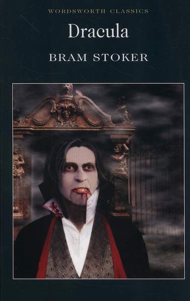
Dracula’s life is pretty stressful, I don’t blame him for smoking some pot for a little relief. As for that underbite: do they make braces for vampires?

These pants look like they’re from the costume closet of a middle school’s underfunded theater program and get trotted out any time they do a show set vaguely in “olden times.” The twerp on the left clearly does not know what to do with his hand.

This is just a picture of Nina Dobrev in The Vampire Diaries with another face pasted on it, so someone should probably sue.
She and everyone else on this cover look especially weird because their bodies and clothing are photorealistic but their faces are illustrations that have been airbrushed into oblivion.
Side note: this Alice in Wonderland cover similarly stole an image of Mia Wasikowska from the 2010 movie and slapped someone else’s face on her.
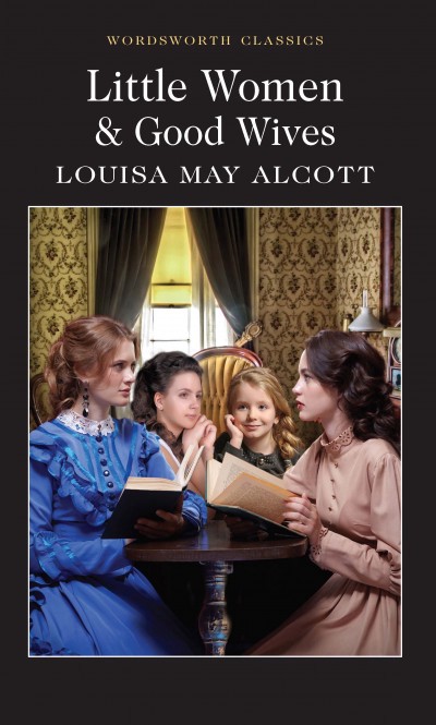
Here’s what they did for this cover: they found a photo of two girls to serve as Jo and Meg, stuck that in the front, and then took Beth from separate image and Amy from a third image and pasted them in the background. They’re all a slightly different style and size and it’s driving me insane. Also, they’re stupidly staring off in different directions, all looking at nothing.
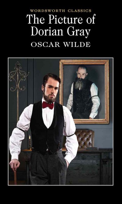
The portrait the title refers to is not only supposed to age in Dorian Gray’s place, it’s also supposed to change to reflect his evil nature. The only thing sinful about this portrait is that terrible beard. I love how he’s glaring out at the reader with one eyebrow raised, like he’s just sick of the real Dorian Gray’s bullshit. Also, Dorian Gray has decided to hang this portrait prominently in his study instead of hiding it in the attic. Don’t you try to shame him, he is not here for it!
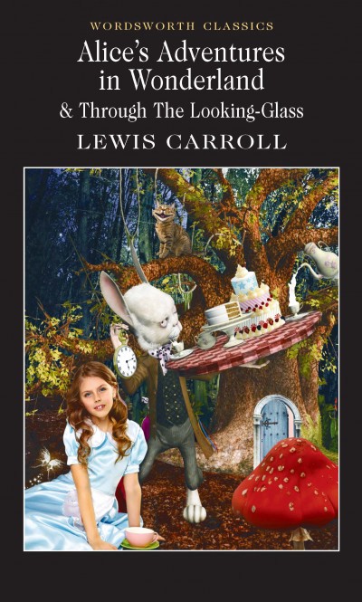
A beloved children’s classic in which a child model wearing a Halloween costume from Party City sits for her glamor shots, blissfully unaware that a house cat with a horrible physical deformity and Brain from Pinky and the Brain lurk behind her.
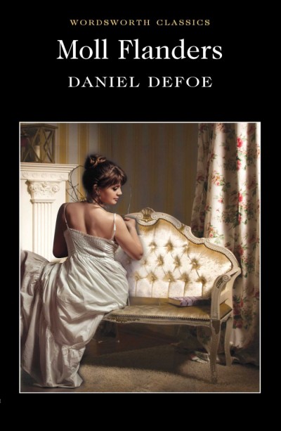
Moll Flanders, the story of a woman whose great tragedy is that she never learned how to sit.
The underbite (is that Dracula in there?), the anime eyes, the expression like he just got kneed in the balls… it’s all too much.

Uncle Tom looks like someone just showed him this cover.
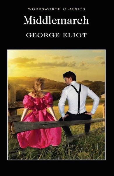
That woman is not sitting on the fence. She is floating behind it in midair. And her suitor is staring at her boobs. It just goes to show you: behind all the high society manners, 19th century people were just as thirsty as we are now!
So, who are the artists responsible for these monstrosities? Thankfully, there are credits on the back covers, which you can view on Amazon. The “Cover Design” seems to always be by the same guy, but I’ve seen two different “Contemporary Artists” credited for the “Cover Illustration”: a Mr. Clair, who is behind Wives and Daughters, and a Ms. Surridge, who is credited for Middlemarch.These are real people that you can hire. I’ve Googled them. They have websites and LinkedIn profiles. According to his LinkedIn, Mr. Clair has done 250 Wordsworth covers. His other work samples on his website seem perfectly normal. Perhaps the illustrators aren’t being paid well and so they do the bare minimum. And yet, these covers look like time and effort was put into making them so intricately ugly.
Clearly they know how to manufacture a normal-looking book and just sometimes choose not to.
What’s crazy is that apparently, Wordsworth Classics covers used to be fine. Reddit has plenty of threads full of people who are angry and incredulous about these literary abominations, and some commenters have pointed out that there was a time when the covers were blue and had perfectly innocuous old paintings as the artwork, which is a route that Penguin and many other publishers take when designing the classics. This cover for The Waves is perfectly fine! So is this one for The Count of Monte Cristo! Even now, if you scroll through their U.S. website, there are some completely fine current editions like The Aeneid and Adam Bede nestled amongst the eyesores. So clearly they know how to manufacture a normal-looking book without spending a ton of money and just sometimes choose not to. Or they just don’t care. Perhaps they know that no matter how bad the covers are, broke book lovers will always buy them because of them unbeatable price. But you would think that a plain black cover with just the title and no art would be cheaper and better than paying artists to make stuff that looks like this.
Then again, I wouldn’t be writing about plain black covers with just the title and no art. Wordsworth Classics, if your plan all along was to create these covers as a publicity stunt so that I would feel compelled to write about them on the internet, congrats, you succeeded!
Check out more for yourself on their U.K. and U.S. websites or Amazon for hours of grim fascination. They make a perfect gift for your enemies!